Avatar
Letter Avatar
Note: You can also add image.
< div > class="avatar small"> ML < /div >
< div > class="avatar small"> LKM < /div >
Icon Avatar


< img class="img-icon" src="images/folder.png" />
< /div >
Different Size Avatar
< div class="avatar small" > < /div >
< div class="avatar medium" > < /div >
< div class="avatar large" > < /div >
Grouped Avatar
-
L
-
K
-
M
-
+4
< li class="group-item" >
< p class="avatar small color-blue" > L < /p >
< /li >
< /ul >
< ul class="container-group" >
< li class="group-item" >
< p class="avatar small color-blue" > K < /p >
< /li >
< /ul >
< ul class="container-group" >
< li class="group-item" >
< p class="avatar small color-blue" > M < /p >
< /li >
< /ul >
< ul class="container-group" >
< li class="group-item" >
< p class="avatar small color-blue" > M < /p >
< /li >
< /ul >
Badge Avatar
< span class="status-online" > </span>
< /div >
< div class="avatar medium >
< span class="status-busy" > </span>
< /div >
Alert
Simple Alert




< img class="alert-icon" src="images/information.png" alt="error" />
< div class="alert-text" > This is Information message < /div >
< /div >
< div class="alert success" >
< img class="alert-icon" src="images/success.png" alt="success" />
< div class="alert-text" > This is Success message < /div >
< /div >
< div class="alert warning" >
< img class="alert-icon" src="images/warning.png" alt="warning" />
< div class="alert-text" > This is Warning message < /div >
< /div >
< div class="alert error" >
< img class="alert-icon" src="images/error.png" alt="error" />
< div class="alert-text" > This is Error message < /div >
< /div >
Alert With Action


< img class="alert-icon" src="images/information.png" alt="error" />
< div class="alert-text" > This is Information message < /div >
< button class="icon-close" onclick=""> X < /button >
< /div >
< div class="alert success" >
< img class="alert-icon" src="images/success.png" alt="success" />
< div class="alert-text" > This is Success message < /div >
< button class="icon-close" onclick=""> X < /button >
< /div >
< div class="alert warning" >
< img class="alert-icon" src="images/warning.png" alt="warning" />
< div class="alert-text" > This is Warning message < /div >
< button class="icon-close" onclick=""> X < /button >
< /div >
< div class="alert error" >
< img class="alert-icon" src="images/error.png" alt="error" />
< div class="alert-text" > This is Error message < /div >
< button class="icon-close" onclick=""> X < /button >
< /div >
Alert with ouline that depicts the status


< img class="alert-icon" src="images/information.png" alt="error" />
< div class="alert-text" > This is Information message < /div >
< /div >
< div class="alert success-outline" >
< img class="alert-icon" src="images/success.png" alt="success" />
< div class="alert-text" > This is Success message < /div >
< /div >
< div class="alert warning-outline" >
< img class="alert-icon" src="images/warning.png" alt="warning" />
< div class="alert-text" > This is Warning message < /div >
< /div >
< div class="alert error-outline" >
< img class="alert-icon" src="images/error.png" alt="error" />
< div class="alert-text" > This is Error message < /div >
< /div >
Icons
Different icon sizes


< img src="images/save.png" alt="save" class="small" />
< img src="images/save.png" alt="save" class="medium" />
< img src="images/save.png" alt="save" class="large" />
Icon with badge


< img src="images/notification.png" alt="" class="extra-small"/ >
< div class="icon-badge-position" > 5 < /div >
< div class="position-relative" >
< img src="images/wishlist.png" alt="" class="extra-small"/ >
< div class="icon-badge-position" > 3 < /div >
< div class="position-relative" >
< img src="images/cart.png" alt="" class="extra-small"/ >
< div class="icon-badge-position" > 2 < /div >
Image
Responsive Image
< img class="img-responsive large" src="images/avatar.png" alt="avatar"/ >
Round Image
< img class="img-round large" src="images/avatar.png" alt="avatar" / >
Input box
Input box
< input type="text" value="" class="input-outlined" placeholder="Name" / >
< input type="text" value="" class="input-filled" placeholder="Name" / >
Different Input attributes
< input type="text" value="Diabled" class="input-outlined" disabled placeholder="Name" / >
< input type="text" value="Read Only" readonly class="input-filled" placeholder="Name" / >
< input type="password" value="" class="input-outlined" placeholder="Password" / >
< input type="search" value="" class="input-outlined" placeholder="search" / >
Input Validation
< input type="text" value="" class="input-noborder-error" placeholder="Name" / >
< span class="validation" > *Name is mandatory* < /span >
< /div >
< div class="flex-column" >
< input type="text" value="" class="input-outlined-error" placeholder="Name" / >
< span class="validation" > *Name is mandatory* < /span >
< /div >
< div class="flex-column" >
< input type="text" value="" class="input-filled-error" placeholder="Name" / >
< span class="validation" > *Name is mandatory* < /span >
< /div >
List
Simple List
- Fruits List:
- Apple
- Mango
- Grapes
- Papaya
- Fruits List Inline:
- Apple
- Mango
- Grapes
- Papaya
< li class="list-item" > Apple </li>
< li class="list-item" > Mango </li>
< li class="list-item" > Grapes </li>
< li class="list-item" > Papaya </li>
< /ul >
< ul class="list-inline" > < strong > Fruits Inline List: </strong>
< li class="list-item" > Apple </li>
< li class="list-item" > Mango </li>
< li class="list-item" > Grapes </li>
< li class="list-item" > Papaya </li>
< /ul >
Nested List
- Fruits List:
- Apple
- Mango
- Alphanso
- Dasheri
- kesar
- Langda
- Grapes
- Papaya
< li class="list-item" > Apple </li>
< li class="list-item" > Mango </li>
< ul class="nested-list" >
< li > Alphanso < /li >
< li > Dasheri < /li >
< li > kesar < /li >
< li > Langda < /li >
< /ul >
< li class="list-item" > Grapes </li>
< li class="list-item" > Papaya </li>
< /ul >
Interactive List
-
Mango
Quantity: 1dozen (12pcs)
Price: 800rs

-
Apple
Quantity: 1Kg
Price: 200rs

< li class="card-list-items" >
< div >
< p > Mango < /p >
< p > Quantity: 1dozen (12pcs) < /p >
< p > Price: 800rs < /p >
< /div >
< div >
< img src="images/delete.png" alt="delete" class="img-responsive extra-small" onclick=""/ >
< /div >
< /li >
< li class="card-list-items" >
< div >
< p > Apple < /p >
< p > Quantity: 1Kg < /p >
< p > Price: 200rs < /p >
< /div >
< div >
< img src="images/delete.png" alt="delete" class="img-responsive extra-small" onclick=""/ >
< /div >
< /li >
< /ul >
Stacked List
-

Tanay
Hello
How are you?
-

Tanay
Tanay accepted your friend request!
< li class="card-list-notification" >
< div class="card-notification-logo" >
< img src="images/whatsapp.png" alt="whatsapp" class="extra-small" />
< /div >
< div >
< p > < strong > Tanay < /strong > < /p >
< p class="card-notification-text" > Hello < /p >
< p class="card-notification-text" > How are you? < /p >
< /div >
< /li >
< li class="card-list-notification" >
< div class="card-notification-logo" >
< img src="images/facebook.png" alt="facebok" class="extra-small" />
< /div >
< div >
< p > < strong > Tanay < /strong > < /p >
< p class="card-notification-text" > Tanay accepted your friend request! < /p >
< /div >
< /li >
< /ul >
Card
Vertical Cards
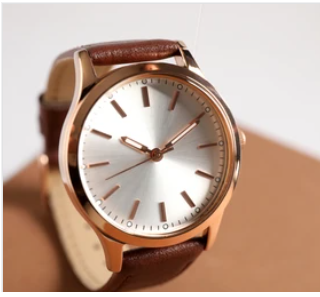
Titan watch
In stock
$100.00

Titan watch
In stock
$200.00
< span class="card-tag">#1 Best Seller < /span >
< div class="card-header" >
< img src="images/watch.png" alt="watch" / >
< /div >
< div class="card-body" >
< h2 class="product-title" > Titan watch < /h2 >
< p class="product-status" > In stock < /p >
< h3 class="product-price" > $100.00 < /h3 > < /div >
< div class="card-footer" > < button class="btn btn-secondary" > Wishlist < /button >
< button class="btn btn-primary" > Add to cart < /button >
< /div >
< /div >
Horizontal card

Titan watch
In Stock
$100

Titan watch
In Stock
$100
< div class="card-header" >
< img src="images/watch.png" alt="watch" class="img-responsive" />
< /div >
< div class="card-body" >
< h2 class="product-title" > Titan watch < /h2 >
< p class="product-status" > In Stock < /p >
< h3 class="product-price" > $100 < /h3 >
< div class="card-footer" >
< button class="btn btn-secondary" > Wishlist < /button >
< button class="btn btn-primary" > Add to Cart < /button >
< /div >
< /div >
< /div >
Text only card
The Hare and the Tortoise
There was once a hare who was friends with a tortoise. One day, he challenged the tortoise to a race. Seeing how slow the tortoise was going, the hare thought he’ll win this easily. So he took a nap while the tortoise kept on going. When the hare woke up, he saw that the tortoise was already at the finish line. Much to his chagrin, the tortoise won the race while he was busy sleeping.
Moral of the story
There are actually a couple of moral lessons we can learn from this story. The hare teaches that overconfidence can sometimes ruin you. While the tortoise teaches us about the power of perseverance. Even if all the odds are stacked against you, never give up. Sometimes life is not about who’s the fastest or the strongest, it’s about who is the most consistent.
< p > There was once a hare who was friends with a tortoise. One day, he challenged the tortoise to a race. Seeing how slow the tortoise was going, the hare thought he’ll win this easily. So he took a nap while the tortoise kept on going. When the hare woke up, he saw that the tortoise was already at the finish line. Much to his chagrin, the tortoise won the race while he was busy sleeping. < /p >
< h3 > Moral of the story < /h3 >
< p > There are actually a couple of moral lessons we can learn from this story. The hare teaches that overconfidence can sometimes ruin you. While the tortoise teaches us about the power of perseverance. Even if all the odds are stacked against you, never give up. Sometimes life is not about who’s the fastest or the strongest, it’s about who is the most consistent. < /p >
Card with text overlay

Titan watch
In stock
$200.00

Titan watch
In stock
$200.00
< div class="product-card opacity" >
< span class="card-tag">#1 Best Seller < /span >
< div class="card-header" >
< img src="images/watch.png" alt="watch" / >
< /div >
< div class="card-body" >
< h2 class="product-title" > Titan watch < /h2 >
< p class="product-status" > In stock < /p >
< h3 class="product-price" > $100.00 < /h3 > < /div >
< div class="card-footer" > < button class="btn btn-secondary" > Wishlist < /button >
< button class="btn btn-primary" > Add to cart < /button >
< /div >
< /div >
< div class="card-text-overlay" > Out of Stock < /div >
< /div >
Modal
Simple Information Modal
Information
Order "5201098756" successfully created.
< div class="modal-type" >
< h1 > Information < /h1 >
< /div >
< p > Order "5201098756" successfully created. < /p >
< button class="btn-primary" > Ok < /button >
< /div >
User Interaction Modal
User confirmation
Would you like to place order?
< div class="modal-type" >
< h1 > User confirmation < /h1 >
< /div >
< p > Would you like to place order? < /p >
< button class="btn-primary" > Yes < /button >
< button class="btn-primary" > No < /button >
< /div >
Rating
Rating
< div class="rating-item" >
< img id="id-star1" src="images/star.png" alt="star" class="extra-small" onclick="star(1)" / >
< /div >
< div class="rating-item" >
< img id="id-star2" src="images/star.png" alt="star" class="extra-small" onclick="star(2)" / >
< /div >
< div class="rating-item" >
< img id="id-star3" src="images/star.png" alt="star" class="extra-small" onclick="star(3)" / >
< /div >
< div class="rating-item" >
< img id="id-star4" src="images/star.png" alt="star" class="extra-small" onclick="star(4)" / >
< /div >
< div class="rating-item" >
< img id="id-star5" src="images/star.png" alt="star" class="extra-small" onclick="star(5)" / >
< /div >
< /div >
Grid
Grid Items
< div class="grid-item" > < /div >
< div class="grid-item" > < /div >
< /div <
< div class="grid-three-items" >
< div class="grid-item" > < /div >
< div class="grid-item" > < /div >
< div class="grid-item" > &t /div >
< /div >
Text Utilities
Text Utilities
Heading 1
Heading 2
Heading 3
Heading 4
Paragraph Text
Small TextGrey Text
< h2 > Heading 2 < /h2 >
< h3 > Heading 3 < /h3 >
< h4 > Heading 4 < /h4 >
< p > Paragraph Text < /p >
< small > Small Text < /small >
< p class="grey-text" < Grey Text < /p >

